Until recently, communication was generally restricted to the capacity of the medium used to transmit it. About 5000 years ago, the Sumerians, Babylonians, and Assyrians used tablets for the purpose of written communication. These tablets were probably made of 2 materials: clay and stone (mostly limestone).1 Clay tablets were portable, about 16 × 14 cm, could be hand-held, and sometimes were double-sided. They were mainly used by students who indented the clay with wedgelike instruments made from bone or wood. It is remarkable that the Sumerians did not break their texts to continue them on the opposite side of the tablet—that is, their intended text had to fit perfectly onto one side of a tablet. Clay tablets were then sun-baked; this process made them fragile and probably explained their relative scarcity. A benefit of sun drying was that the material could be recycled by soaking in water.
Communications intended for public display and those that should last longer were presented in a larger medium: the stone stele. The legal code of Hammurabi was written on a diorite stone standing over 2 m high. Steles were universal forms of public communications; fast forward nearly 4000 years and one finds them in the Mayan and other Mesoamerican cultures, fulfilling the same goal. Because it is relatively easy to carve, limestone was the preferred stele material in the ancient and new worlds. Romans improved on the tablet by making it out of wax. These were mainly used to teach writing to children, and their obvious benefit was that they could be easily “erased.”
Writing was revolutionized by the creation of the scroll, a medium with larger capacity. Scrolls were built from papyrus, parchment, vellum, or paper. Individual pages of any of these materials were consecutively assembled to create a roll that could be meters long.2 Scrolls were read horizontally from left to right, vice-versa, or both ways. Held together by wood rollers, one side was unrolled while the opposite was rolled to keep the reading area down to a comfortable size. These were the most popular media to store knowledge from antiquity (Alexandria and Rome) to the European Middle Ages. Similar to clay tablets, scrolls could be used on both sides (called an “opistograph”). Scrolls, such as the Torah, are still used in religious ceremonies. Jack Kerouac wrote On the Road on a scroll of paper. This famous modern scroll, now the property of the owner of the Indianapolis Colts (an American football team) has been displayed in museums around the world.3 Hanging or vertical scrolls were used for ceremonial communications and are the direct predecessors of computer scroll reading and movie credits. Today, hanging scrolls are mostly decorative.
The next step in evolution was the accordion (or concertina) book. Accordion books probably originated in the Orient, Japan and/or China. They tended to be made of paper and offered a benefit over tablets and rolls in that they stood up by themselves, freeing the hands of readers (similar to your computer screen). In China, some accordion books were made of strips of bamboo. Nowadays the making of accordion books has been relegated to children, and some artists who use them as their medium to produce beautiful works of art.
Because papyrus is delicate, lasting only a few decades, and difficult to produce (the plant is found mainly along the Nile river), a different medium (parchment) was needed. The king of Pergamon is credited with having invented it (thus its name in Spanish: “pergamino”). Parchment is also somewhat difficult to make as it comes from the skins of animals. Although the Chinese invented paper way before the Common Era (CE), they did not use it as a writing medium until about 300 CE.4 Around this time (200–400 CE), the first codices appeared in Central Europe. Codices are very similar to our current books in the sense that their sheets are attached on 1 side, allowing easy access to any portion of the book. Codices were initially made of parchment, but around 1200 CE, the Arabs brought paper to Europe where it was rapidly and widely adopted. Bookmaking was a personal activity, mainly done by monks, and thus literature was not widely accessible during the medieval times. Of course all of this changed in the mid-15th century when Johannes Gutenberg invented the printing press and bookmaking became an industry.
At this point in this short narrative, booklovers would fault me if I did not comment on incunables. “Incunables” are books manufactured before 1500 CE. They were printed from wood blocks or by means of the first movable type printing presses invented by Gutenberg. The word “incunable” comes from the Latin term for “cradle,” implying the earliest of something. From a grammatic standpoint, it is important to note that words or text were not broken and continued elsewhere on a routine basis until codices and books were used.
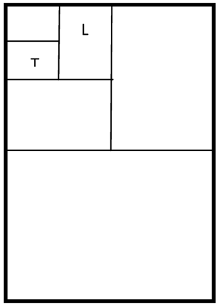
A page is 1 side of a leaf or sheet of paper and, I think, a thing of beauty. When a book lies flat, the left page is called the “verso” and the right one the “recto” (verso meaning the reversed or back side of the leaf). Both together are called the “spread” of a book. Recto pages have odd numbers, while verso pages are even-numbered (at 1 time in the past, only folios [see below] were numbered, not pages). Most book pages contain a “header” (also called a “running head”) that generally refers to the title of the book or chapter and is displayed over the main text of each page. “Footer” refers to material found at the bottom of a page, separate from the main text (some of the funniest footers I have read are found in a book of essays called Consider the Lobster by David Foster Wallace). *The size of books is historical in nature and originated about 300 years ago, because machines used then could cut or “trim” paper to only a certain size. If you take a piece of paper measuring 1 square meter and fold it in half 4 times as shown on the next page, you end up with a piece of paper (labeled L) measuring 210 × 280 mm (8.5 × 11 inches), which is the standard letter size and also a page size used for hardcover books produced in the United States (Fig 1).
Diagram illustrating the normal dimensions for standard letter size (L) and trade paperback books (T).
If a letter-size sheet of paper is again folded in half (labeled T on the next page), one ends up with a paper of the size (135 × 216 mm or 5.3 × 8.5 inches) used for so-called trade paperback books (I am not sure why mass paperback book pages measure 110 × 178 or 130 × 198 mm). These differences in book sizes were apparently created to distinguish among them as they are sold in different fashions and at different prices. Larger books are thought to be more “literary,” whereas the smaller ones are considered “good” values and are sold mostly in airports, train stations, supermarkets, and so forth.5 The size of “pocket” book pages is sometimes capricious, and as an example, I offer the French publisher Actes Sud. Its founder, Hubert Nyssen, measured his hand from the bottom of his palm to the tip of his index finger and from the outer aspect of the hypothenar eminence to the outer aspect of his thenar region. If he could hold this size paper in his hand, it must be perfect for all! The folding method illustrated above also establishes the size of common sheets of paper used in the United States (from smaller to larger: letter, legal, junior legal, ledger, tabloid, and so forth). These sizes are slightly larger than those found in books, and I will explain why below.
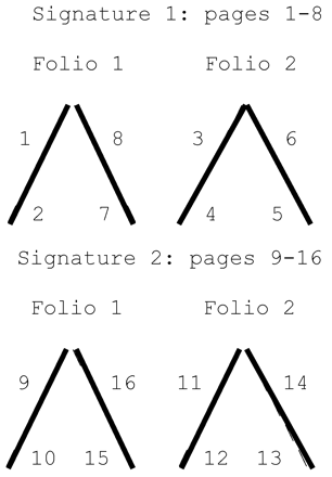
Books (and the American Journal of Neuroradiology [AJNR]) is considered one strictly speaking) are composed of concertina-like “signatures.” The name given to each signature depends on its length: folio equals 2 pages; quarto, 4; sexto, 6; octavo, 8, and so forth (confusion arises because the same terms are sometimes used to describe different paper sizes). The largest signatures are 32 pages because this is the traditional limit for machines that stitch or glue them together. If you have ever seen a signature, you know it is weird and at first glance makes no sense. Folio signatures look like this6:
For signature 1, folio 2 will be placed into folio 1, creating continuous pages once the outer edges (folds in larger signatures) of the pages are cut or trimmed. Trimming involves removing about one-eighth of an inch around the sides, thus bringing down the measurements previously given for paper (vide supra) to what you find in books. The left side of the signatures is bounded by stitching or gluing. Stitching can be done by oversewing or sewing through the fold (the preferred method so that books can open flat). Conversely, glue is applied to the angle of the signatures, and then these are bound to a piece of cloth or paper (as is done for AJNR). The problem with this type of binding is that with time the signatures may become loose and separate. In any book, journal, or magazine, the cover has 4 consecutive parts: front or first, front inner or second, back inner or third, and back or fourth cover. Hardcover books (at least in the United States) often have dust jackets that also have front and back covers as well as front and back flaps. In journals and magazines, the second, third, and fourth parts of the cover are premium advertising space (in books dust jackets provide extra space for reviews, summaries, and biographies). A flyleaf is that empty leaf at the start and end of a book (not found in journals or magazines). Regular pages have a central print space surrounded by blank margins. The framework of a page is not a fickle choice. Methods used to determine the most eye-pleasing placement of text include those of van der Graaf and Tschichold (see below, red square is the print space, illustrated for only 1 side of the spread) (Fig 2).
Diagram illustrating method used to determine the most pleasant dimension of text margins.
The above diagram illustrates the major rules of thumb regarding page margins: different sizes for all 4. The outer and bottom ones are double the size of the inner and top ones, respectively. This is also known as the “golden ratio” for page margins and creates the most eye-pleasing ones. Journals and magazines where space is at a premium sacrifice aesthetics and nearly always have uniform margins with the text close to the edges of the paper (Jack Kerouac left no margins in his scroll). Some pages contain columns of text (generally 2, but up to 4 are common and 3 are said to be the most pleasant layout). This is done to break down long lines of text (rule of thumb: a line longer than 60 characters is difficult to read).7 How wide should a column be? Another rule of thumb is that the point size of the font multiplied by 2 equals its width in picas (1 pica is about 4.3 mm). Thus, the AJNR font size is 9.5, times 2 equals 19, times 4.3 equals 82 mm, which is the width of our columns (go ahead and try it).
“Marginalia” refers to notes, comments, and other writings on page margins. Notations by famous persons can add value to a book while those that you or I create probably will not. Computer programs such as Microsoft Word allow comments on the margins of pages and some even allow Web-sharing of this type of marginalia (called “shared annotations”). E-readers such as Amazon's Kindle are capable of allowing marginalia and other annotations and go further by permitting you to share them with other readers via social networking programs. E-reader pages reproduce basically all aspects of paper, albeit at a higher cost and with increased difficulties when it comes down to marginalia (it is easier to scribble on the margin of a paper page than to type there by using the tiny physical or virtual keyboard found in E-readers).
E-readers try to give readers the same experience as print. (I often ask myself why. If I buy an E-reader, it is to have a completely different experience; if not, why not buy the book?) Of course, with digital books, space is no longer a consideration as it was with print and most have variable page and font sizes. Adobe PDFs also imitate the print experience as their software allows you to “leaf” though a document that simulates printed pages. Leafing is a feature found on the iPad (Apple, Cupertino, California) (something that I find anachronous and bothersome while I have heard others say it is cute). Your computer screen is basically a vertical never-ending virtual scroll in which the length of the text matters little. Paradoxically, as the capacity to store and display the written word increases, our attention spans decrease and make it impossible to take full advantage of these media.
The evolution of the page seems to have closed the circle: from clay tablets to computer tablets (witness the iPad), from ancient scrolls to scroll computer reading, from parchment pages to E-paper and E-readers. The capacity of the page no longer determines its contents. Margins are becoming superfluous as small screens must be completely filled with text to take maximum advantage of their viewing areas. Marginalia is no longer private with E-readers. I am not a fanatic of a specific medium, but as long as you are reading something, it will be contained within pages.
Footnotes
-
↵* N.B. This is what a footer looks like. It is not commonly used in scientific writing and perhaps it should be. N.B. stands for “nota bene,” which instructs the reader to pay attention to something. Endnotes are not the same thing as footers or footnotes. Endnotes appear separately at the end of an article, essay, chapter, or book. If you need to call attention again to something in a footnote, you can add another N.B. as follows: N.B.2
- © 2012 by American Journal of Neuroradiology


